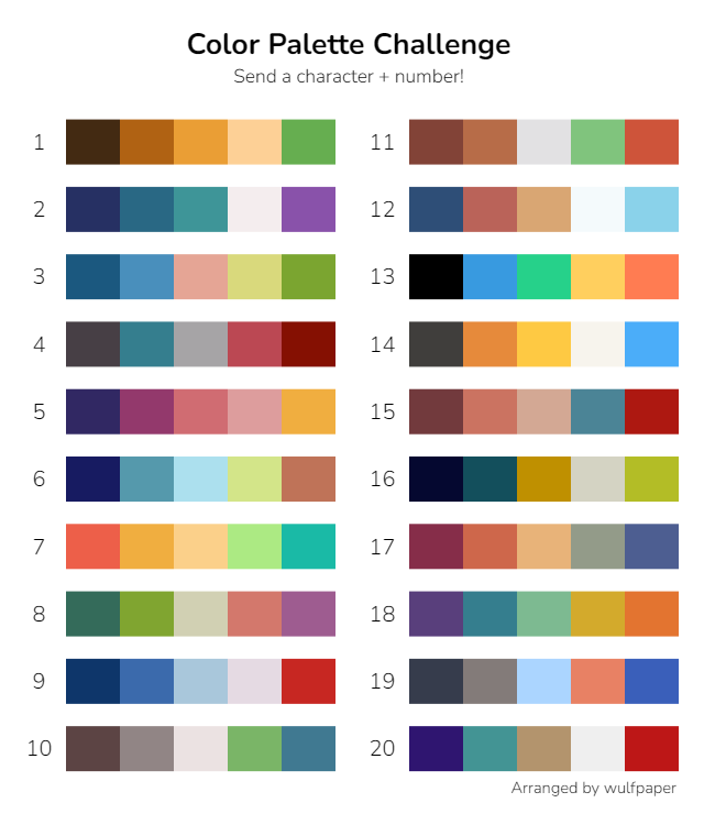
Color palette challenge (without the colors)
I haven't done a color palette challenge since my tumblr days, but they seemed like a good opportunity to practice value work. So I set my iPad to grayscale and picked a random challenge chart off Google, then asked friends to give me a character and number. These were the results:
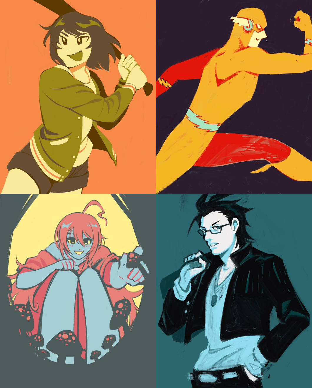
- Subaru Nagayoshi (THE iDOLM@STER Million Live!)
- Barry Allen/The Flash (DC Comics)
- Syoko Hoshi (THE iDOLM@STER Cinderella Girls)
- Genbu Kurono (THE iDOLM@STER SideM)
I can't really say I like them...
The original palette set's colors are outside of my usual preferences, but since I chose itin grayscale I wouldn't have known.
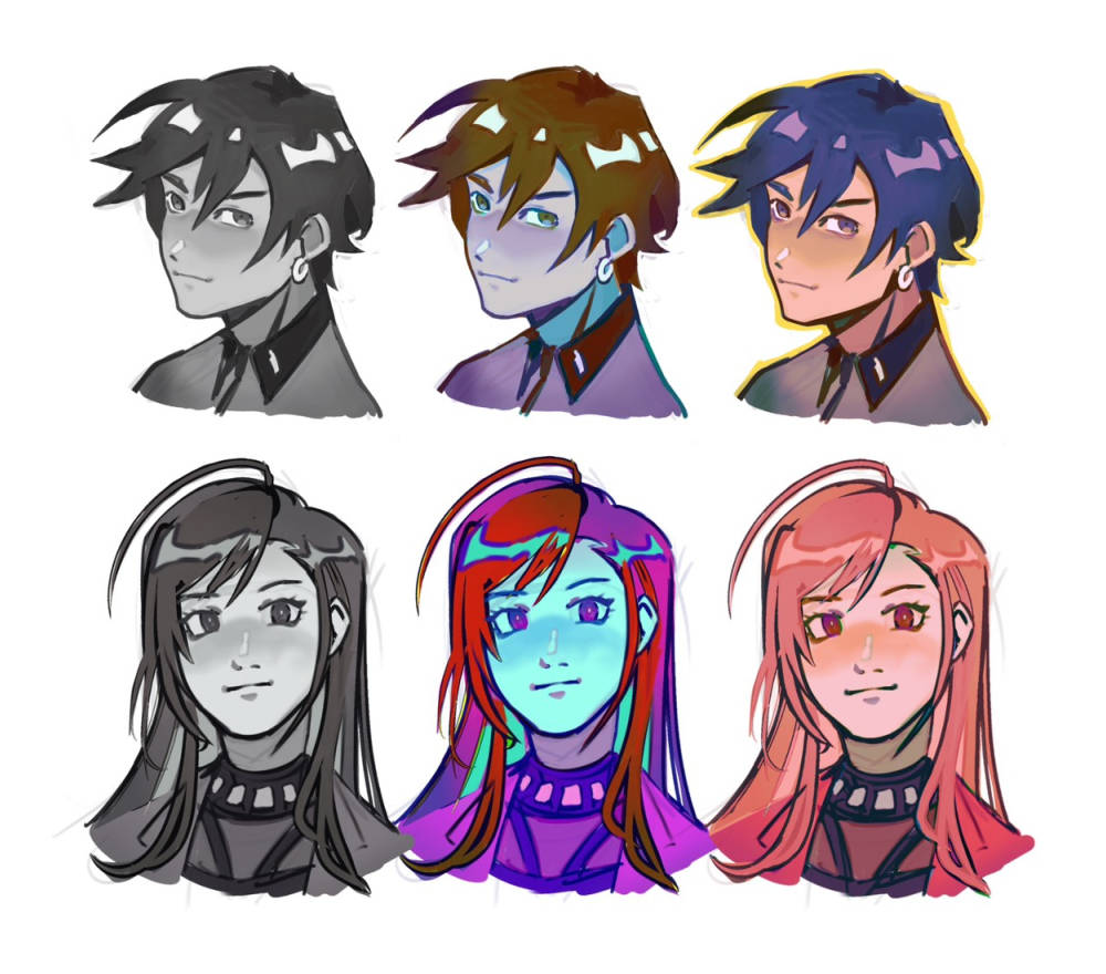
Still, the exercise is fun and can be useful if you treat it solely as value practice, whether that's color blocking as I did here or using it as the basis of a painted value study. There was some video about how value is more important than color—proven by how setting your device to grayscale, and randomly picking colors with appealing values would create a cohesive image once you set your screen back to normal. I tried this before and it looked terrible.
Using a color palette chosen from a curated list would not have resulted in whatever this is.
In any case, the typical purpose of the color palette challenge is that you can use the suggested colors to represent a particular atmosphere in the work, which I did not do because I didn't know what the colors were.
Next time, I want to try a color palette challenge to design OCs or environments—not limiting myself to those colors but incorporating them into a greater whole.
I've created my own color palette challenge if you'd like to try this out yourself. Most palettes are directly color-picked from my own artwork. The image is set as gray in the web browser, but will appear in color when you download it. Remember to set your device to grayscale before you save and open it in your drawing program!