Tsuyoshi Kusano & Atsushi Nishigori Tokyo Pop Guide interview
In 2016, the IOEA (International Otaku Expo Association) and JMAG (Japanese Association of Manga Anime Game Creators) published Tokyo Pop Guide, a 108-page guide to travelling in Japan for English-speaking otaku. A shorter version, Toko Pop Guide mini, was distributed for free at IOEA-associated conventions.
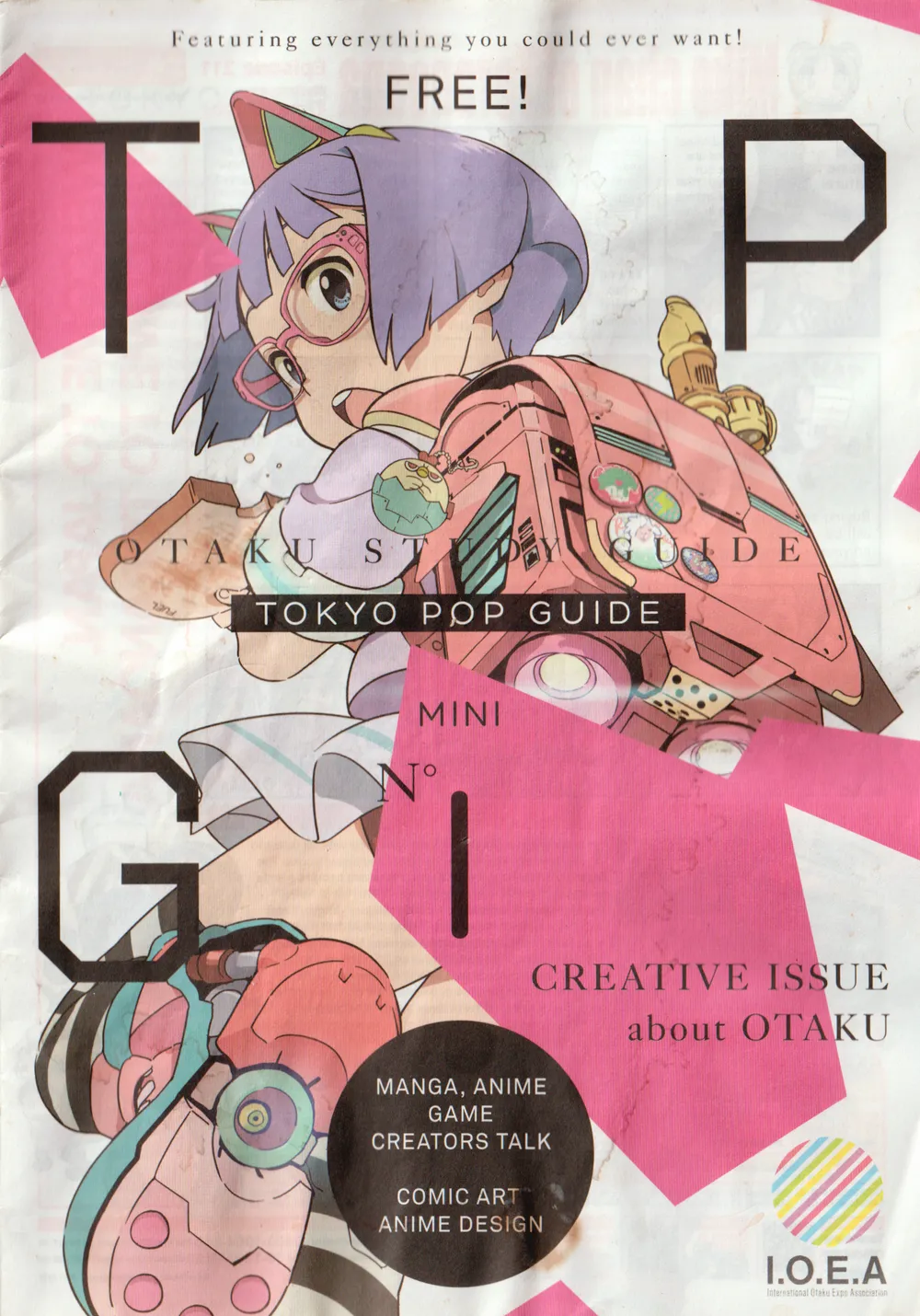
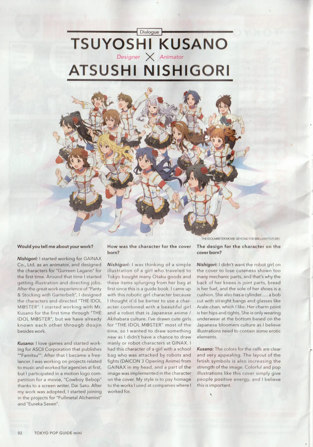
Its first issue featured cover art by Atsushi Nishigori (Gurren Lagann, THE iDOLM@STER) with graphic design by Tsuyoshi Kusano (Full Metal Alchemist, Bungou Stray Dogs), accompanied by an interview between the two.
I've scanned a (very waterlogged) copy of the interview below. You can find high-resolution files on Google Drive, or jump to the transcript.
Scan
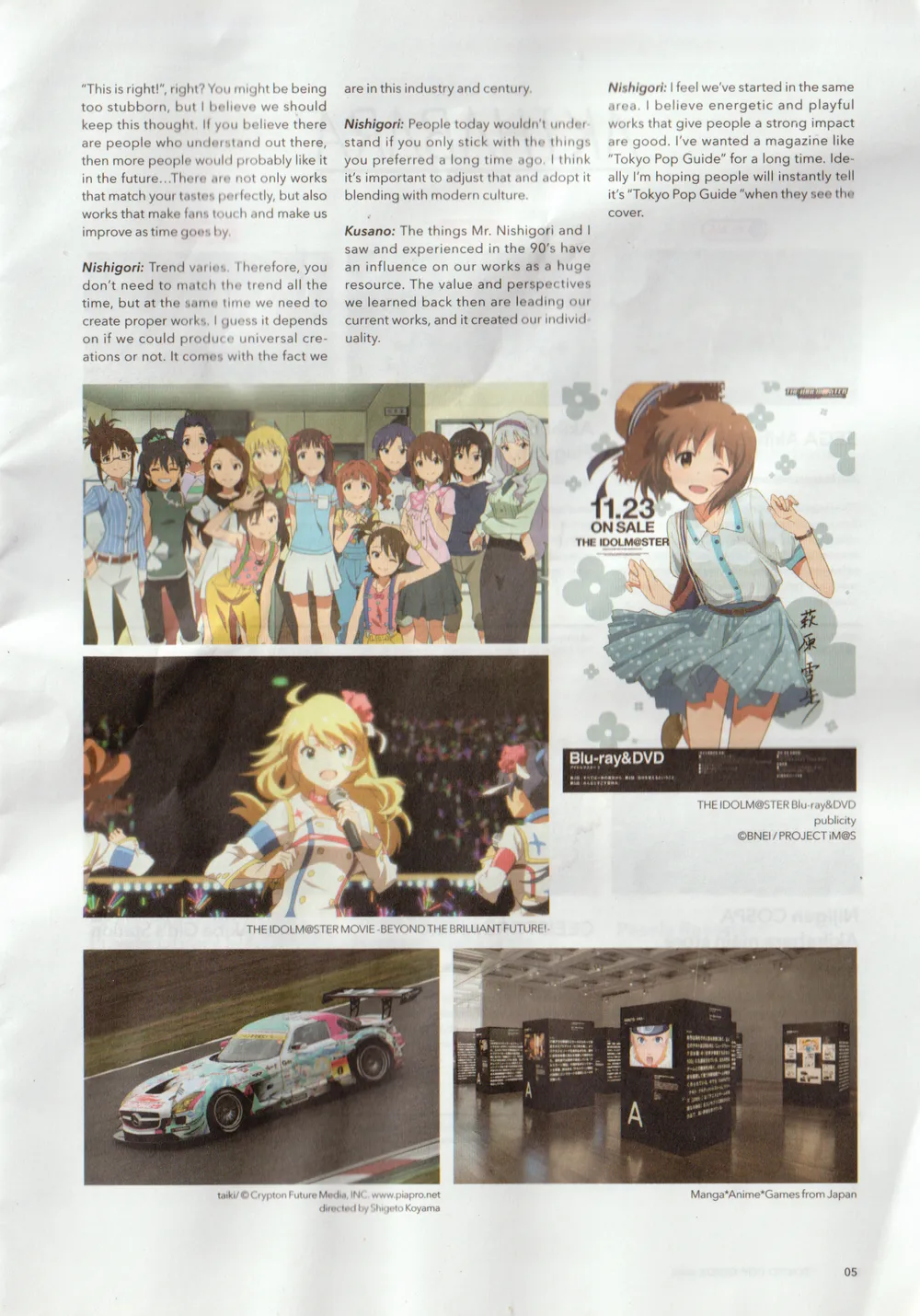
Transcript
This transcript is taken exactly as-is from the scan. The pamphlet does not list an English translator.
Would you tell me about your work?
Nishigori: I started working for GAINAX Co., Ltd. as an animator, and designed the characters for "Gurreen Lagann" for the first time. Around that time I started getting illustration and directing jobs. After the great work experience of "Panty & Stocking with Garterbelt", I designed the characters and directed "THE IDOLM@STER". I started working with Mr. Kusano for the first time through "THE IDOLM@STER", but we have already known each other through doujin besides work.
Kusano: I love games and started working for ASCII Corporation that publishes "Famitsu". After that I became a freelancer. I was working on projects related to music and worked for agencies at first, but I participated in a motion logo competition for a movie, "Cowboy Bebop" thanks to a screen writer, Dai Sato. After my work was adopted, I started joining in the projects for "Fullmetal Alchemist" and "Eureka Seven".
How was the character for the cover born?
Nishigori: I was thinking of a simple illustration of a girl who traveled to Tokyo bought many Otaku goods and these items splurging from her bag at first since this is a guide book. I came up with this robotic girl character because I thought it'd be better to use a character combined with a beautiful girl and a robot that is Japanese anime / Akihabara culture. I've drawn cute girls for "THE IDOLM@STER" most of the time, so I wanted to draw something new as I didn't have a chance to draw manly or robot characters at GAINAX. I had this character of a girl with a school bag who was attacked by robots and fights (DAICON 3 Opening Anime) from GAINAX in my head, and a part of the image was implemented in the character on the cover. My style is to pay homage to the works I used at companies where I worked for.
The design for the character on the cover born?
Nishigori: I didn't want the robot girl on the cover to lose cuteness shown too many mechanic parts, and that's why the back of her knees is joint parts, bread is her fuel, and the sole of her shoes is a cushion. She also has a cylinder... a bob cut with straight bangs and glasses like Arale-chan, which I like. Her charm point is her hips and tights. She is only wearing underwear at the bottom based on the Japanese bloomers culture as I believe illustrations need to contain some erotic elements.
Kusano: The colors for the cells are clear and very appealing. The layout of the fetish symbols is also increasing the strength of the image. Colorful and pop illustrations like this cover simply give people positive energy, and I believe this is important.
When I looked at the illustration, I thought it's cute, but gazing at it made me realize several things.
Kusano: That's right. This illustration makes people want to explore and notice things. The contexts that have created and nourished in Japan are included in some places, and it's fun for viewers and readers to interpret them.
Nishigori: The bird on her school bag is called Neet Bird. NEET stands for Not in Education, Employment or Training, namely a moocher bird. It's like a chick that became an adult, but doesn't want to come out and doesn't want to work!
Kusano: I see!
Nishigori: It's mechanic so Neet Bird is a robot.
Kusano: I'd love to get this sticker!
Nishigori: Her recorder has a scope and it becomes a weapon when she blows.
What would you name her?
Nishigori: She likes battles, but she's very slim. She works hard, loves cats, lolita look, and items... What do you think, Mr. Kusano?
Kusano: If she was thinner and brunette, "Kei" would be cool!
Nishigori: Something that makes us feel integrity and unity of 5 characters would be good. How about Mr. Kusano's son's name?
Kusano: "Yu"? That sounds nice and cute! His hair style is similar!
Nishigori: Well then "Yu" it is!1
How would the characters be developed in the future?
Nishigori: It depends on how I feel at the time. If I decide it now, I'll get bored. I improvise, but try to balance everything. We can also create anime as we have many creators.
About the color of the cover and layout
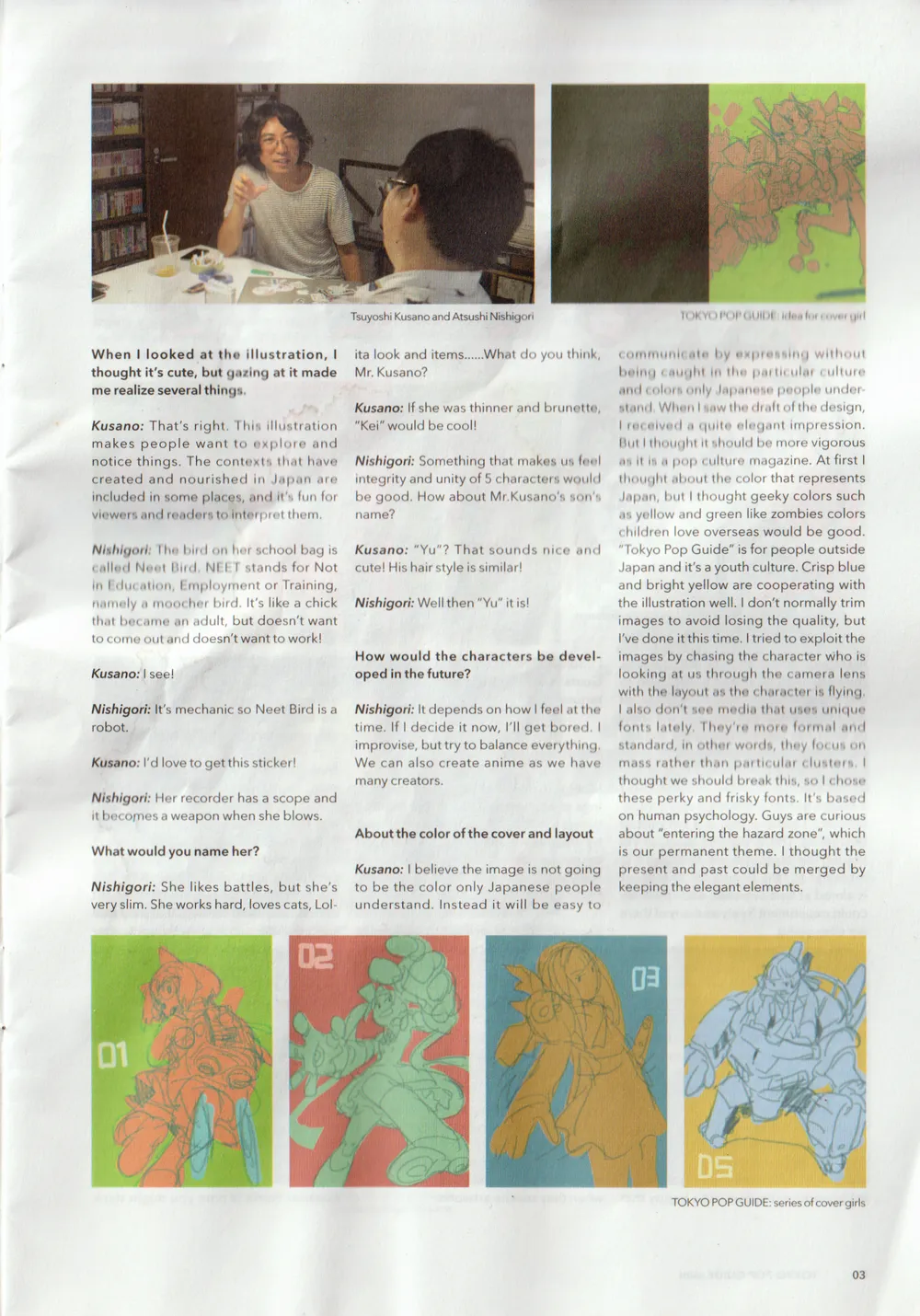
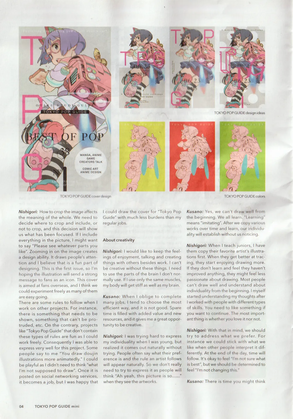
Kusano: I believe the image is not going to be the color only Japanese people understand. Instead it will be easy to communicate by expressing without being caught in the particular culture and colors only Japanese people understand. When I saw the draft of the design, I received a quite elegant impression. But I thought it should be more vigorous as it is a pop culture magazine. At first I thought about the color that represents Japan, but I thought geeky colors such as yellow and green like zombies colors children love overseas would be good. "Tokyo Pop Guide" is for people outside Japan and it's a youth culture. Crisp blue and bright yellow are cooperating with the illustration well. I don't normally trim images to avoid losing the quality, but I've done it this time. I tried to exploit the images by chasing the character who is looking at us through the camera lens with the layout as the character is flying. I also don't see media that uses unique fonts lately. They're more formal and standard, in other words, they focus on mass rather than particular clusters. I thought we should break this, so I chose these perky and frisky fonts. It's based on human psychology. Guys are curious about "entering the hazard zone", which is our permanent theme. I thought the present and past could be merged by keeping the elegant elements.
Nishigori: How to crop the image affects the meaning of the whole. We need to decide where to crop and include, or not to crop, and this decision will show us what has been focused. If I include everything in the picture, I might want to say "Please see whatever parts you like". Zooming in on the image creates a design ability. It draws people's attention and I believe that is a fun part of designing. This is the first issue, so I'm hoping the illustration will send a strong message to fans as an icon. This cover is aimed at fans overseas, and I think we could experiment freely as many of them are easygoing.
There are some rules to follow when I work on other projects. For instance, there is something that needs to be shown, something that can't be protruded, etc. On the contrary, projects like "Tokyo Pop Guide" that don't contain these types of rules are fun as I could work freely. Consequently I was able to express very well for this project. Some people say to me "You draw doujin illustrations more animatedly." I could be playful as I didn't need to think "what I'm not supposed to draw". Once it is posted on social networking services, it becomes a job, but I was happy that I could draw the cover for "Tokyo Pop Guide" with much less burdens than my regular jobs.
About creativity
Nishigori: I would like to keep the feelings of enjoyment, talking and creating things with others besides work. I can't be creative without these things. I need to use the parts of the brain I don't normally use. If I use only the same muscles, my body will get stiff as well as my brain.
Kusano: When I oblige to complete many jobs, I tend to choose the most efficient way, and it is not good. Spare time is filled with added value and new resources, and it gives me a great opportunity to be creative.
Nishigori: I was trying hard to express my individuality when I was young, but realized it comes out naturally without trying. People often say what their preference is and the rule an artist follows will appear naturally. So we don't really need to try to express it as people will think "Ah yeah, this picture is so..." when they see the artworks.
Kusano: Yes, we can't draw well from the beginning. We all learn. "Learning" means "imitating". After we copy various works over time and learn, our individuality will establish without us noticing.
Nishigori: When I teach juniors, I have them copy their favorite artist's illustrations first. When they get better at tracing, they start enjoying drawing more. If they don't learn and feel they haven't improved anything, they might feel less passionate about drawing. Most people can't draw well and understand about individuality from the beginning. I myself started understanding my thoughts after I worked with people with different types of skills. You need to like something if you want to continue. The most important thing is whether you love it nor not.
Nishigori: With that in mind, we should try to address what we prefer. For instance we could stick with what we like when other people interpret it differently. At the end of the day, time will follow. It's okay to feel "I'm not sure what is best", but we should be determined to feel "I'm not changing this."
Kusano: There is time you might think "This is right!", right? You might be being too stubborn, but I believe we should keep this thought. If you believe there are people who understand out there, then more people would probably like it in the future... There are not only works that match your tastes perfectly, but also works that make fans touch and make us improve as time goes by.
Nishigori: Trend varies. Therefore, you don't need to match the trend all the time, but at the same time we need to create proper works. I guess it depends on if we could produce universal creations or not. It comes with the fact we are in this industry and century.
Nishigori: People today wouldn't understand if you only stick with the things you preferred a long time ago. I think it's important to adjust that and adopt it blending with modern culture.
Kusano: The things Mr. Nishigori and I saw and experienced in the 90's have an influence on our works as a huge resource. The value and perspectives we learned back then are leading our current works, and it created our individuality.
Nishigori: I feel we've started in the same area. I believe energetic and playful works that give people a strong impact are good. I've wanted a magazine like "Tokyo Pop Guide" for a long time. Ideally I'm hoping people will instantly tell it's "Tokyo Pop Guide" when they see the cover.
The kanji is listed as 遊 on another page.↩