my favorite manga cover
undoubtedly it's GIANT KILLING volume 1.
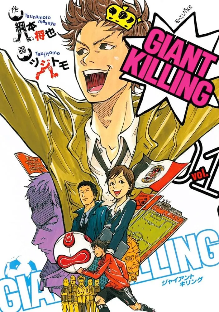
everything about the composition and color balancing is seriously weird but it all flows so well. it's honestly impressive that you can put such an odd mix of colors together and still have it work.
there are essentially two inverted triangles, main (red/green/teal) and secondary (purple/orange/yellow), with the latter being solid/flat to haze out details that would distract from the main image. using different colors from the main set helps emphasize said set's inverted triangle composition, highlighting tatsumi more than his scale already demands (interestingly, it's a triangle composition where one character takes up two points, and so while tatsumi is clearly the focus character, tsubaki also gets a good amount of focus by virtue of being the odd point out). the choice to use a set of colors instead of one is also an oddity in of itself.
it's just very whimsical and charming! GIANT KILLING is a soccer manga about a genius coach that comes back from england to lead a japanese football team. and so its covers tend to tap into british pop art in a way no other manga does. (the back covers are more based on british punk.)
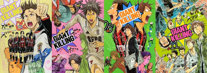
but while the latter volumes still have interesting compositions, the colored background really ruins it. when the rest of the color scheme is so discordant, it's basic white that pulls it all together. latter volumes also rely too much on patterned backgrounds to fill in space. it's especially egregious as the lighting on the figures becomes more intense and 'realistic'. the earlier, flatter tones worked well with the pop art style without looking boring—as a result of the analog drawing process creating slight modulations in tone—but now its all harsh coloring and shading that looks like it's ripped outta dragon ball Z.
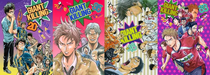
i say latter volumes but this change starts as early as volume 7 and there are practically no covers i like after 13. mind you this manga has 70 volumes.
but back to volume 1: i love the charming little details like the scribbly crown, harkening back to british royalty and tatsumi's position as the leader of his team. the tiny soccer legs on the creators names! the way their names are a little bit wavy as if tasumi is shouting them out. the fact that tatsumi isn't even looking at the camera—not unusual in covers that portray a 'scene', but definitely odd in covers that are more 'arranged'. the tiny hand-drawn details of emblems and logos like the adidas teamgeist 2006 FIFA world cup soccer ball. minaturizing the main setting of the story—the soccer field—so that it fits into the cover like it's just another character. what other cover has even done something like this!
the original identity of the manga shines through in the english version too. so often manga with more basic fonts and logos will get localized with a corny vtuberesque logo, but here the english version is practically the same with only a slightly altered font. although it does remove the katakana title beneath the blue GIANT KILLING, which leads to a bit of imbalance with the blue soccer ball on the left.
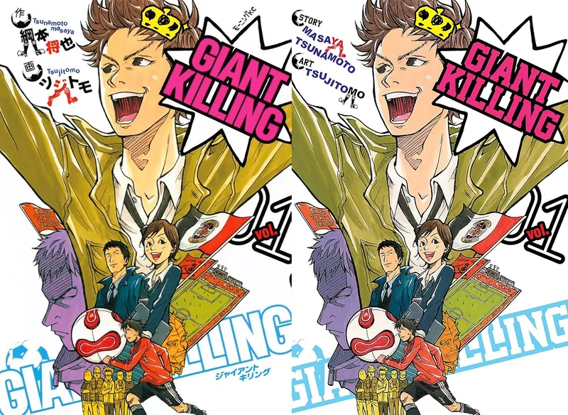
i love the art in GIANT KILLING. it's not necessarily good anatomically or linewise but i think the best parts of the cover are all accentuated by the flexibility of its style. forreal, you can't get such a glorious inverted triangle comp without the willingness to draw your main character as a triangle on the first cover.